In the realm of branding, where every element is meticulously crafted to convey a message and evoke emotions, color stands as a powerful tool. It has the ability to shape perceptions, influence consumer behavior, and ultimately define the identity of a company in the eyes of its audience. Let’s delve into how colors are strategically utilized to paint a picture of success for businesses.
The Psychological Impact of Color

Colors evoke specific emotions and associations rooted in psychology, making them a critical component of brand identity.
Red
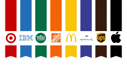
Often associated with passion, energy, and urgency. Brands like Coca-Cola and Target use red to stimulate excitement and create a sense of urgency in their messaging. This is because red has been shown to increase heart rate and stimulate appetite, making it ideal for encouraging quick decision-making and impulsive purchases. Whether it’s a sale announcement, a limited-time offer, or a call to action, incorporating red into design elements like logos, advertisements, and packaging can significantly amplify the sense of urgency and drive consumer behavior.
Blue
Blue symbolizes trust, reliability, and professionalism. Companies such as IBM and PayPal leverage blue to instill confidence and establish authority in their respective industries. IBM’s iconic blue logo has become synonymous with innovation and trust in the tech industry. The use of blue helps to project an image of reliability and expertise, reassuring clients and stakeholders alike. Similarly, PayPal utilizes shades of blue to emphasize security and dependability in online transactions, aiming to alleviate concerns about financial safety among its users.
Green
Green represents growth, health, and sustainability. Brands like Whole Foods and Land Rover use green to convey environmental consciousness and a commitment to well-being. For brands like Whole Foods, green serves as a visual cue that communicates their dedication to health-conscious products and environmentally-friendly practices. This association helps to build trust and loyalty among consumers who prioritize sustainability in their purchasing decisions. The shade of green used by Land Rover often conveys ruggedness, durability, and off-road abilities.
Orange
Orange is a dynamic and energetic color that evokes warmth, enthusiasm, creativity, and a sense of adventure. Brands such as Home Depot strategically use orange to stand out and resonate with their target audience in the construction and do-it-yourself (DIY) sectors.
Yellow
Yellow is a color that radiates happiness, optimism, positivity, and energy, making it a powerful tool in branding to evoke feelings of joy. Brands like McDonald’s strategically use yellow to associate their products and services with a sense of happiness and positivity
Purple
Purple is a color rich in symbolism, often associated with royalty, luxury, spirituality, and mystery. Its historical rarity and association with wealth and prestige make it a powerful choice for brands looking to convey a sense of elegance and quality. Hallmark, known for its greeting cards and gift products, strategically uses purple as its primary color to create a perception of high-quality craftsmanship and emotional connection with consumers.
Brown
Brown is a color that conveys earthiness, reliability, warmth, and stability, making it a strategic choice for brands seeking to establish a grounded and trustworthy image. UPS (United Parcel Service) effectively utilizes brown in its branding to evoke a sense of reliability and dependability in its delivery services.
Black/White
Apple has strategically utilized both white and black in their branding and product design to convey specific messages about their technology and brand identity. White represents purity, cleanliness, simplicity, and innocence, while black symbolizes power, sophistication, and formality. By incorporating these colors into their products and marketing, Apple effectively communicates a blend of innovation, elegance, and functionality.
These associations are not coincidental; they are carefully chosen to align with the brand’s values and resonate with the target audience on an emotional level.
Building Brand Identity and Recognition
Consistency in color usage across all brand touchpoints is crucial for building a strong and recognizable identity. Consider brands like Starbucks with its iconic green or UPS with its distinctive brown. These colors have become synonymous with the brands themselves, instantly recognizable by consumers worldwide. By maintaining visual consistency, brands reinforce their values and create a cohesive identity that consumers can easily identify with and trust. This consistency builds brand equity over time, fostering loyalty and increasing brand recall. In a crowded marketplace, differentiation is essential for success.
Practical Considerations in Design
Beyond emotional and cultural significance, practical considerations play a role in color choice. Factors such as readability, accessibility (especially for color-blind individuals), and adaptability across various mediums (digital, print, etc.) must be taken into account to maintain effective brand communication and user experience.
The strategic use of color in branding is a nuanced art that goes beyond aesthetics—it is a powerful tool for shaping perceptions, influencing consumer behavior, and building a distinctive brand identity. By understanding the psychological impact of colors and applying them strategically, companies can create compelling visual narratives that resonate with their audience and drive success.
If you need help building or refining your brand identity, contact
Amplimark! Our team is ready to listen to your goals and assist you in developing and perfecting your identity.


